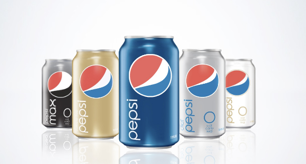
Wow! Pepsi!
Okay, so I might be late on the topic of this, but I was there when the packages started changing and the new Pepsi logo and brand appeared. I remember standing in Smith's Grocery Store on 400 South in Salt Lake debating whether it was a good idea or not.
At first I didn't like it. Too minimalist and 50s/60s for a drinks company. But, it was then pointed out to me, that it stands out from every other drink on the shelf. And it truly does.
While Coca-Cola are going for as much detail as possible, with swirls, fake droplets and visual stimuli galore, Pepsi are giving us a break, keeping it plain, recognisable, and less cluttered.
What it says to me is, chose me, drink me, I won't give you a headache if you look at the can too long.

My one and only qualm now is that the E has a Pepsi swirl in it. That seems like the doing of some marketer or account handler and not the creative who designed it though. It seems out of place and doesn't do anything. No adding or taking away from the brand.
On top of the new logo/bottle/can there are fantastic billboard posters with strong block colours, and large type. I love type. The words Wow, Lol, Awesome etc etc are written as big as they can fit with the pepsi logo sitting in place for the letter O. Enough said. Again, it's an advertising campaign that doesn't overwhelm you. You know what it is, you know what they're saying, everything is clear – there's no need to go all Cluedo about it and stress your brain out trying to piece things together.
My theory is that this the beginning of a new cycle. Gone is the mystery, here comes the answer on a Pepsi-Platter.
Here are the billboards combined into a fantastic flash or after effects video.
I would dare say that this is one of the most 'refreshing' pieces of design ever. The entire idea and concept is phenomonal, and then to coincide and use the refreshing of America because of their new president is just a genius piece of marketing. It's simple. Everything gets changed – everything gets refreshed. It was time for change, and everything is.
To take it further you should check out their Pepsi site, their microsite, and their youtube site.
Labels: advertising, branding, brands, design, graphic design, logo, Pepsi


1 Comments:
I do like those new cans. Yes I do.
Post a Comment
Subscribe to Post Comments [Atom]
<< Home